
JAN niche concept
niche fragrance & cosmetics retail chainJAN niche concept is one of Ukraine’s largest niche fragrance and beauty retail chains, founded in Odesa in 1990. In the year of its 35th anniversary, the brand embarked on a visual transformation through a comprehensive rebrand. It was the perfect moment to refresh its visual identity, redefine its communication, and express a new level of ambition.
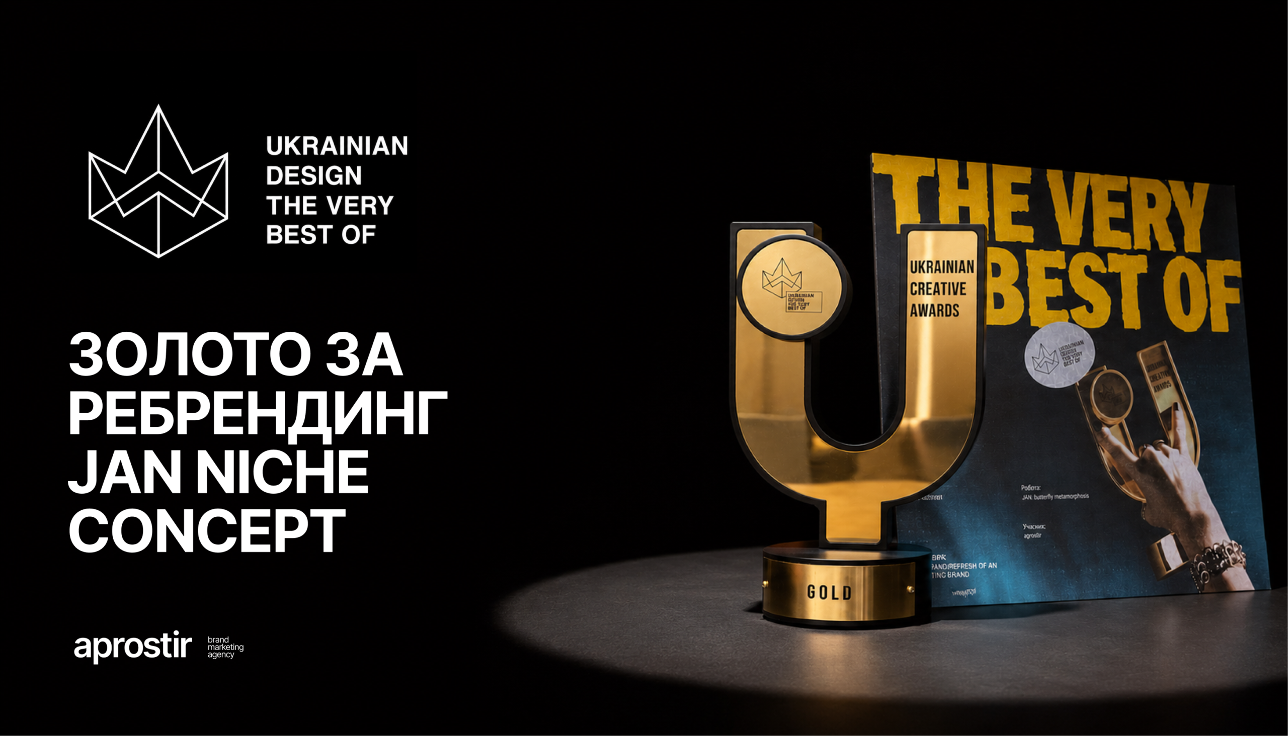
Gold at Ukrainian Design
In May 2026, our rebranding project for JAN niche concept received the Gold Award at the national competition Ukrainian Design: The Very Best Of in the Rebrand / Refresh of an Existing Brand category.
We are grateful to JAN niche concept for their trust, openness to new ideas, and courage to embrace change.
Here’s the story of a transformation that went far beyond visual identity.
The butterfly мetamorphosis
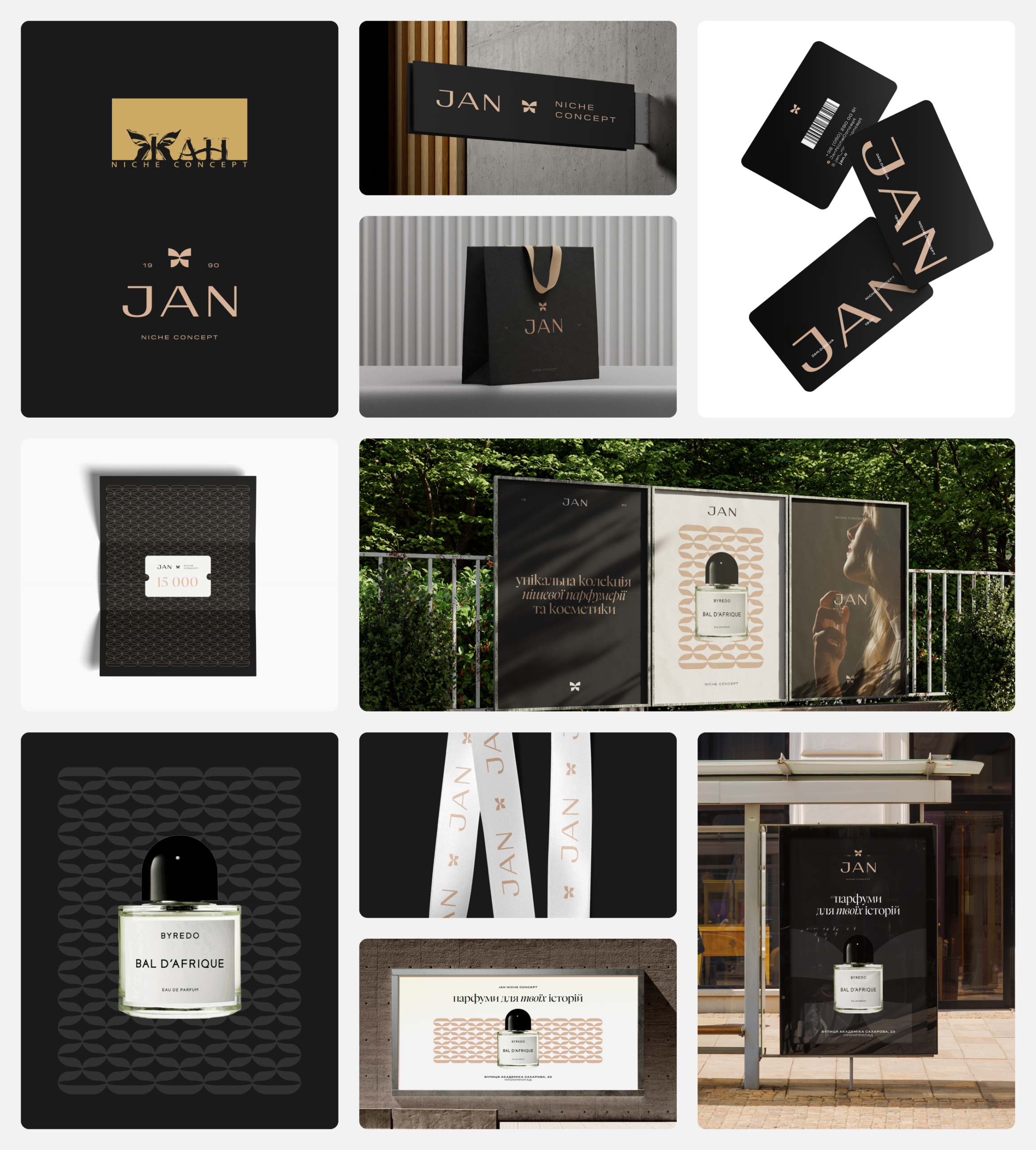
One of the key requirements of the rebrand was to preserve the butterfly — the brand’s most recognizable symbol. Over the past 35 years, it has become an iconic element of JAN niche concept and a familiar mark for its customers.
The new logo is built around a butterfly that has matured and evolved into a more refined, elegant form. At the same time, it can be perceived both as a butterfly and as a decorative gift ribbon.
We also transitioned from Cyrillic to the Latin alphabet, reflecting the brand’s openness to new markets, and incorporated the founding year into the logo as a symbol of heritage, experience, and continuity.

Visual identity
The logo became the foundation of the entire visual identity. Its distinctive curves evolved into a signature pattern that extends seamlessly across different brand touchpoints.
We designed a cohesive identity system that works consistently across everything—from blotters and tissue paper to shopping bags, loyalty cards, storefront signage, and outdoor advertising.
Rather than creating just a logo, we developed a complete visual language that is both scalable and highly adaptable.
As print plays a key role in the brand experience, it was essential to create a system that performs consistently across different printing techniques and materials. To achieve this, we refined the color palette to a restrained foundation of black, white, and a rose gold accent.
As a result, JAN’s visual language now reflects the true level and maturity of the brand.
Advertising campaign
One of the key objectives was to increase JAN’s brand awareness in Ivano-Frankivsk, attract new customers, and break the perception that the brand “wasn’t for them.”
Although JAN had already established a presence in the city, it had not yet become part of the local community.
We approached this challenge from a different perspective. JAN was already part of the city—not through its stores, but through people’s personal stories. Fragrances accompany us through different moments of life, becoming part of our memories and experiences.
This insight led to the campaign idea and its key message:
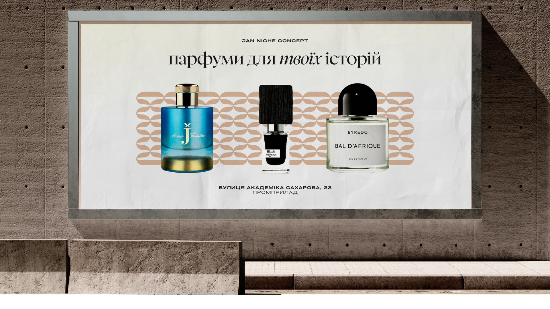
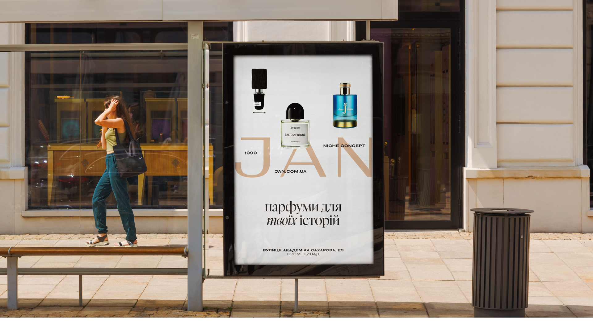
JAN niche concept — fragrances for your stories.

Making the brand part of the city
To strengthen JAN’s presence in Ivano-Frankivsk, we deliberately anchored the campaign to the brand’s store at Promprylad.
We brought this idea to life across all key communication channels—from billboards and citylights to cinema screens, social media, and targeted digital advertising.
Our goal was to build one clear association:
Fragrance — JAN — Promprylad.
As part of the advertising campaign
- we developed the campaign creatives and the concept for the brand video;
- prepared production briefs for the photo and video shoots;
- analyzed the brand’s previous marketing activities in the city;
- created concepts and scenarios for proprietary brand events;
- explored local events and integration opportunities;
- developed collaboration concepts with local brands.

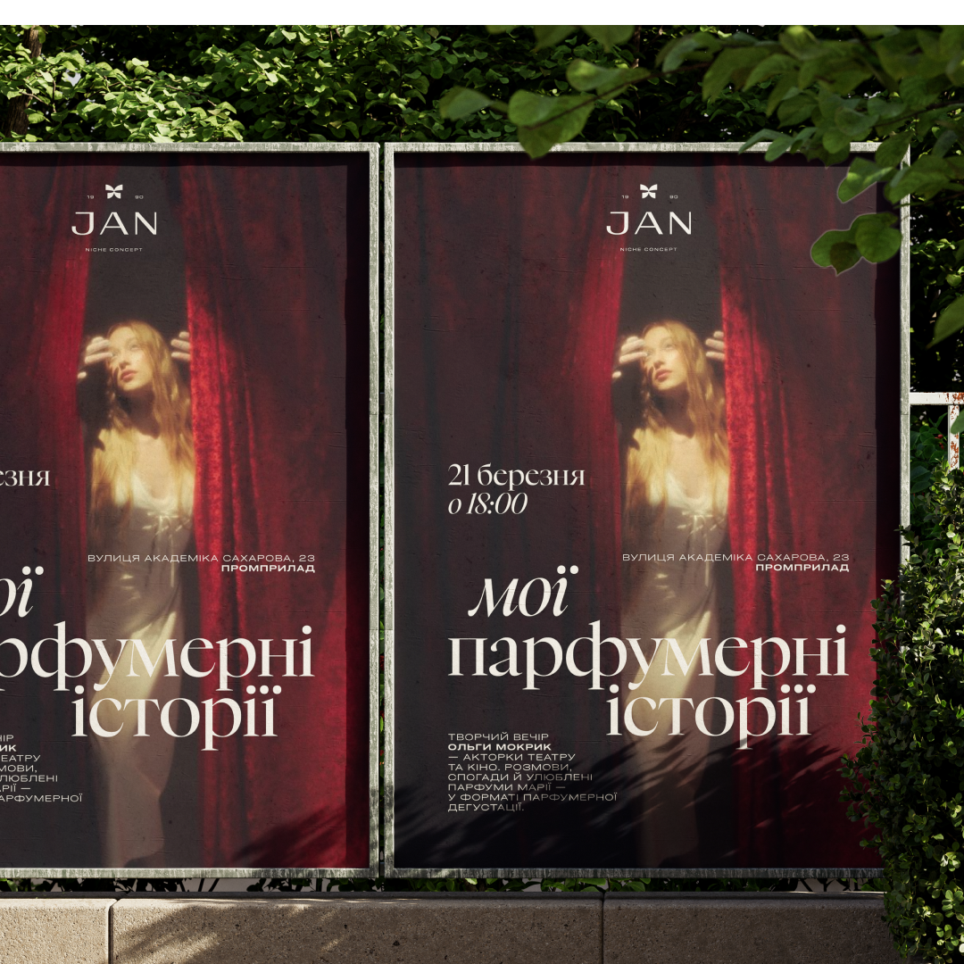
Design
Beyond the core brand identity, we also developed:
- advertising banners and billboards for multiple cities across Ukraine;
- website banners;
- a brand presentation;
- and even the logo for JAN Sport—the brand’s initiative that brings together sports teams, tournaments, and support for emerging talent.

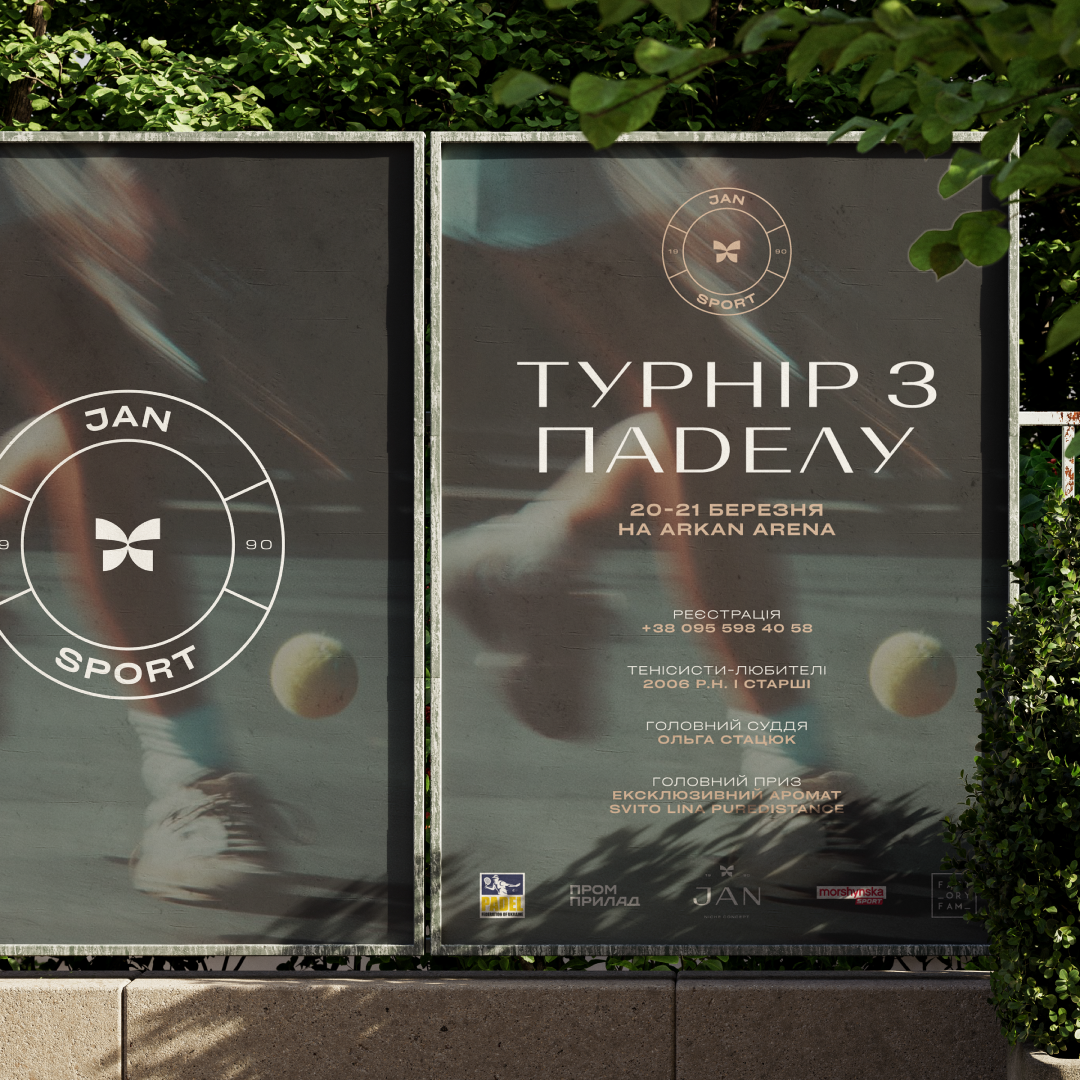
Launching the new visual identity
We also helped JAN niche concept introduce its new visual identity by creating a launch post and video for social media, developing the key messages behind the transformation, and presenting the new visual system to the brand’s internal team.
Epilogue
JAN now has a cohesive brand system—from visual identity to communication—that works as one unified whole.
The project was recognized with the Gold Award at the national competition Ukrainian Design: The Very Best Of in the Rebrand / Refresh of an Existing Brand category.
But the greatest reward for our team was seeing the new identity move beyond mockups and become part of the real world.
Project team
Founder & CEO — Iryna Stetsevych
Head of Design — Yurii Parypa
Middle Graphic Designer — Iryna Kuts
Creative Strategist — Iryna Moroz
PR Strategist — Yaryna Klid
Marketing Strategist — Tetiana Khmilevska

